What Is the Optimal LP Size? Width and Image Size Guidelines for PC and Smartphone
Published:
Last Updated:
Category: SEO & Content
Published:
Last Updated:
Category: SEO & Content
Authors: Shusaku Yosa
When creating an LP (landing page), the thing people tend to hesitate over first is “how to design the size (width).” Because PCs and smartphones have different screen sizes, if you do not know the appropriate size, the layout can break or images can become blurry. This article clearly explains what LP size is, starting from the basics, the width guidelines for PC and smartphone, the way to think about image sizes, and the points for creating an LP at the optimal size.
LP size refers to design values related to the dimensions of a page, such as the “width” and the “size of images” when displaying and creating a landing page. Web pages express size in the unit of pixels (px), and the LP's width and the image size of the main visual are also decided based on these pixels.
What you want to keep in mind here is thinking of the “content width” and the “full-width background width” separately. The content width where you place text and elements is decided based on readability, while the background color and background image are spread out to fill the screen (full width)—this two-tier structure is common. When considering LP size, distinguishing these two makes it easier to organize.
LP size is not limited to a matter of appearance; it also affects results. If you make a mistake in size design, the following problems arise.
An LP is a page for getting people to “see it, be convinced, and take action.” If the size is not appropriate, you lose users right at that entrance. That is precisely why the initial size design is important.
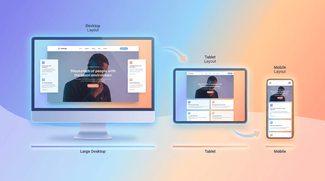
For a PC-oriented LP, consider the “overall display width” and the “content width that places the contents” separately.
The width that places actual content such as text and images is often kept to about 960px–1200px in general. Wider than this and a line becomes long and hard to read; narrower and only the margins stand out. In recent years large monitors have also increased, so using around 1000px–1200px as a guideline lets you display things in good balance across many environments.
Designs that spread the background color and the main visual's background image to the full screen width (full width) are mainstream. In this case, to keep the background from cutting off even on large monitors, it is reassuring to prepare the background image assuming a width of about 1920px. The common structure is to keep the content itself within the central content width and spread only the background to full width.
PC screen resolutions vary, but currently Full HD (1920px wide) is widely used. Therefore, the approach of “making the background able to withstand up to 1920px” and “keeping the content within 1000–1200px” becomes a design that is easy to accommodate across many environments.
In recent years, much of the access to LPs comes from smartphones, so designing on the premise of smartphone display is very important.
A smartphone LP basically displays at the full screen width. As a reference width when designing, it is common to create assuming 375px (a standard logical width used by many smartphones). While taking a little margin (padding) on the left and right, the basic approach is to flexibly stretch and shrink the contents to fit the screen width.
Because smartphones have different screen sizes depending on the model, rather than building with a specific fixed width, the current mainstream is to build with “responsive design” in which elements stretch and shrink according to the screen width. By specifying the width as a percentage, or deciding only the maximum width and keeping it variable within, you get an LP that is less likely to break down across various devices.
LPs make heavy use of images such as main visuals and diagrams. For image size, the point is to think of the “display size” and the “actual data resolution” separately.
Starting with smartphones, many of today's displays are high-definition (Retina, etc.), and preparing images at twice the display-size resolution makes them display cleanly. For example, for an image displayed at 375px wide, the idea is to export the actual data at about 750px wide. With this, the image displays crisply without blurring even on high-definition screens.
The main visual, which determines the first impression of the LP, is where the balance between image quality and display speed is important. Export it according to use, using about 1920px wide for a PC full-width background and about 750px wide for smartphones as a guideline. Serving different images for PC and smartphone lets you optimize for each and also curbs wasteful data transfer.
Images require attention not only to resolution but also to file size. Choose the format according to use, such as JPEG for photos, PNG for transparency or illustrations, and WebP when prioritizing lightening. Furthermore, reducing the file size with a compression tool improves display speed while maintaining image quality.
An LP is completed in a single page and commonly uses a structure that scrolls long vertically. There is no strict rule for the vertical length; “a length that can carry the information you want to convey without excess or shortage” is appropriate. However, longer is not necessarily better.
What matters is drawing the user's interest in the area displayed first (the first view) and having them read on naturally in the subsequent flow. If it is needlessly long, they leave partway; if it is too short, the persuasive material is insufficient. Be conscious of placing the necessary information in the appropriate order without waste. It is good to think of the vertical length as a “result,” not something to decide from the start.
Finally, let's organize the practical points for designing LP size appropriately.
LP size refers to design values related to the dimensions of a page, such as the landing page's width and the size of images. For PC, the basic approach is to keep the content width to about 1000–1200px while making the background full width (assuming 1920px), and for smartphones, to base it on 375px and keep it variable with responsive design.
For images, prepare them at about twice the display size to accommodate high-definition displays, and do not forget to optimize file size. Then, designing with smartphones—where access is highest—as the starting point and always checking on real devices at the end is the shortcut to creating an LP that is easy to view and leads to results. Design size carefully at the initial stage as an important element that relates not only to appearance but also to display speed and conversion.
An explanation of what kind of engagement model SEO consulting is. Covers the main support content, the benefits and dra...
Five principles for categorising your site, plus 10 structural design patterns including topic, problem, and industry ax...

SEO services fall into six types: consulting, content production, technical support, link building, tools, and in-house ...