How to Make a Project Schedule Readable | Showing Delays at a Glance with a Progress Line
Published:
Last Updated:
Category:
Published:
Last Updated:
Category:
Authors: Shusaku Yosa
You built a schedule and shared it, and yet at the weekly meeting you still end up asking about each item one by one. That happens because the schedule contains only the plan. If the gap between plan and actual does not appear on the chart itself, nobody can read whether things are behind. This article covers how to make a schedule readable, centred on the progress line: a single zigzag line that shows delays at a glance.
Most unreadable schedules are not short on decoration; they are short on readable information. Adding colours and gridlines will not make a chart readable if what is needed for a judgment is absent.
What someone looking at a schedule wants to know is these three things.
A schedule that merely lines up planned bars cannot answer even the first. Adding a percent-complete column does not fix it either, because the reader still has to go line by line and compare the numbers in their head. When a chart takes effort to decode, it is not functioning as a chart.
The progress line solves this with a single line.
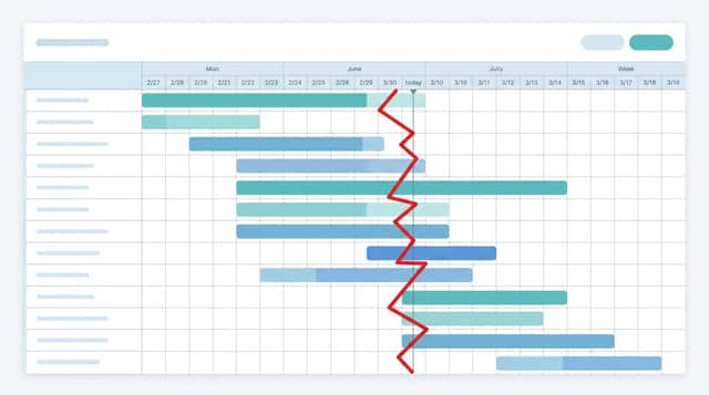
A progress line connects, from top to bottom, the point each activity has actually reached as of a status date. Activities that are behind pull the point to the left, activities that are ahead push it to the right, so the line takes on a jagged, lightning-bolt shape. In Japanese it is called an inazuma-sen, literally a lightning line, for exactly that reason.
It has long been used in construction and manufacturing scheduling, but it works in any industry where several activities run in parallel.
The value of a progress line is that you can read the situation without reading any numbers.
The fourth is particularly hard to spot from a column of percentages. You catch it because it appears as a shape.
Decide first which point in time the picture represents. Usually the day of the weekly meeting or the day before. Draw a vertical line from top to bottom at that date. This line is the reference for every judgment that follows.
Look at where the status-date line crosses each row's bar. If it passes through the halfway point of the bar, that activity should be 50 percent complete. If the bar has not started yet, zero; if it has already finished, one hundred.
Convert each activity's actual percent complete into a position on its bar and mark a point there. At 60 percent actual, that is six-tenths along from the left end of that row's bar. The important thing here is to take the position as a proportion of the bar's length, not by date.
Activities not yet started take a point at the left end of the bar. Completed activities take the right end.
Start at the top of the status-date line, join each row's point in order with straight segments, and return to the bottom of the vertical line. That completes the progress line.
Use red or orange, clearly distinct from the bars. Making the line thick means the shape stays readable even from a distance.
Easily overlooked, but leaving last time's line in a pale colour changes how much the chart tells you. If a point has moved further left than last week, the delay is widening.
A single line tells you only that you are behind now. Two or three side by side show whether the gap is closing or growing. That difference maps directly onto whether you need to act.
Pick the polyline shape from the insert menu and draw straight over the cells. This is the quickest route, and at up to around 20 rows it takes only a few minutes each time.
The drawback is that updating the percentages does not move the line. Run it on the assumption that you redraw every time. Put the other way round, if you only update weekly, this method is entirely sufficient.
Calculate coordinates from the percentages and overlay a scatter chart (the type joined with straight lines) on the schedule. The x coordinate is the bar's start position plus the bar's length times the percent complete; the y coordinate maps to the row number.
Once set up, the line moves whenever you update a percentage, though the initial configuration takes real effort. For schedules with many rows, or ones you will use over a long period, this is the better fit.
Start with method A. Whether the practice of drawing a progress line sticks comes first; automating it can wait. Building the mechanism and then finding that nobody enters the percentages any more is the common failure.
A useful technique, but it loses meaning once its premises break down.
The most common failure. If owners are entering "about 70 percent" by feel, the line joining those numbers is a chart of feelings. Before introducing a progress line, align how the percentage is determined.
What works in practice is counting deliverables. "18 of 30 pages done, so 60 percent" uses a countable denominator, and the value does not change from person to person. For work that cannot be counted, restricting the scale to zero, fifty, and one hundred percent is another workable approach.
Past 50 rows, the line oscillates too finely to read as a shape. For reporting, build a separate version rolled up to major activities, condensing to around 10 to 15 rows before drawing the line. Having a detailed schedule and a reporting schedule as two different documents is perfectly acceptable.
Drawing an activity stalled on a client's review the same way as one you are late on will lead to the wrong remedy. Mark waiting rows with a different colour of point, or change the row's background, so you can tell whether you are behind or waiting on someone else.
Before drawing the line, the underlying schedule has to be in a legible state. These three have the largest effect.
A progress line only works once the timing of drawing it is fixed. If there is a weekly meeting, decide that you redraw the day before. "Whenever it is needed" will always be skipped in a busy week.
In the meeting, deal only with the rows where the line juts left. There is no need to walk through every row in order. Run it that way and the reporting takes less time, while the discussion concentrates on where the problems are.
One more thing: decide in advance what happens when a delay is found. Visibility alone changes nothing. Move the date, cut the scope, add people. Settling which of these applies and who decides turns the progress line from a reporting artifact into a decision-making tool.
A progress line assumes the percentages are entered correctly. In a spreadsheet, though, keeping them updated depends entirely on human discipline. In a week when entry lapses, drawing the line does not reflect reality.
And where several campaigns or projects run in parallel with a separate schedule for each, you cannot see which one is at risk across the whole. Xtrategy manages campaign schedules alongside budget and KPIs on a single screen, so you can track progress across multiple campaigns at once.
A progress line needs no special tooling and can be started this week. Draw the status-date line and join one line by hand. Imbalances that were invisible as a column of numbers should start appearing as a shape.
Find more of our articles on Google
A beginner's guide to to-do lists and how they differ from task lists. Covers a five-step way to use one, examples of cl...
What a Gantt chart is and the elements it is made of, with a four-step way to read one. Covers how it differs from a WBS...

The basics of project management, built around the three things you trade off and the two main ways of working. Covers s...